


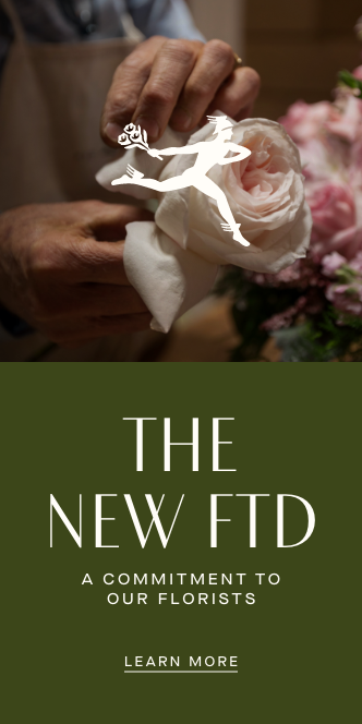
FTD has unveiled a complete rebranding. At the center of the rebrand is a refined version of the florist network’s Mercury Man logo. Shopify’s e-commerce platform will power FTD’s new website, which will roll out in phases starting Sept. 30 and, according to the company, providing an intuitive and streamlined shopping experience. The FTD brand wants to reclaim its legacy by helping customers celebrate the moments of their lives. “It is not a ‘new FTD’ in the sense of us wanting to do away with the old. It’s a timeless positioning that is still 100% relevant today. It just needed to be dusted off a bit.”
Full Article Below Source

To Rebrand for the Future, Florist Network FTD Looks to Its Past
The 111-year-old collective tapped creative agencies Base Design and RoAndCo for the refresh
Florist network FTD today unveiled a complete rebranding.
To borrow a line from Shakespeare, sometimes what’s past is prologue.
At least that seems to be the thinking at florist network FTD, which unveiled a rebranding that harkens back to its founding more than a century ago as a nonprofit collective.
“Rebrands are typically viewed as a reinvention, and it’s not often that you have such a rich story like FTD’s to work with,” Annelies De Rouck, the company’s chief creative officer, told Adweek. “For us, the real challenge here was determining how to fit 111 years of history into one clear and concise brand story that would resonate with both our customers and our florists.”In particular, she said the brand wanted to reclaim its legacy in helping customers celebrate the moments of their lives. De Rouck added. “It is not a ‘new FTD’ in the sense of us wanting to do away with the old. It’s a timeless positioning that is still 100% relevant today. It just needed to be dusted off a bit.”
The Elements
At the center of the rebrand is a refined version of the florist network’s Mercury Man logo, the fleet-footed Roman god of commerce and messages, which is in itself an apt symbol for the rapid evolution of retail in recent years given the impact of ecommerce. The logo will be accompanied by a “sleek” version of the FTD brand mark and its date of founding—1910—all in the same shade of olive green.
The new branding will begin to appear on all of the florist network’s touch points, including packaging, starting Sept. 30.
“This rebrand is the next step in FTD’s turnaround and continued evolution, but it’s also much more than that,” De Rouck said.
The florist network, for example, is also overhauling its product assortment and will launch on Shopify.
In fact, Shopify’s ecommerce platform will power FTD’s new website, which will roll out in phases beginning Sept. 30 and, according to the company, provides an intuitive and streamlined shopping experience.
The updated website will be joined by a new florist partner platform this fall, which will merge Shopify’s site customization and UX experience with FTD’s operational capabilities to create a one-stop shop for florists to manage orders, according to FTD.
The Process
The brief De Rouck gave herself and FTD’s creative agency Base Design was to look and behave like the heritage brand that it is while bringing the florists themselves back to the forefront.
“Having been on my radar for their work revamping heritage brands, I knew [Base Design would] be a true partner in bringing the vision we had for the brand to life,” De Rouck said. “Their method included a sequence of brand immersion and brand strategy, as well as several rounds of exploratory design of the key elements including our logo, fonts and color palette.”
One of the first considerations was selecting a hero color. FTD eventually landed on olive green after first picking a different shade, and then proceeded to other elements like branding and tone of voice.
The process also involved working with creative agency RoAndCo, which was selected given its work with creating direct-to-consumer brands, to formulate a fresh look for ProFlowers, a newer brand under FTD’s aegis.
“Once we had the brand guidelines for both brands, my in-house creative team did an excellent job translating the work of Base Design and RoAndCo to all of our assets, adding their own skill and creativity to it,” De Rouck said. “Our illustrations for both brands, for example, are entirely made in-house.”
Going forward, customers and florists can expect to see additional strategic partnerships, florist-focused initiatives, refined floral offerings and expanded non-floral gifts.
“We plan for this updated look and feel to be with us for decades to come,” De Rouck said.


